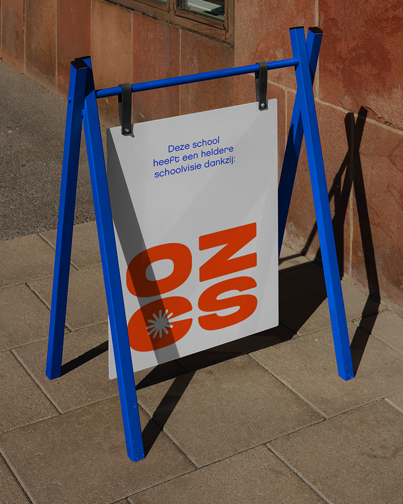

“Every child, regardless of background, deserves a bright future through quality education.” That is the mission of OZCS, a school policy group that has been supporting and advising schools to provide children with the best education since 1820. Naturally, we could not pass up the opportunity to help modernise this organisation to earn our place in heaven.
In our search for a unifying theme within their narrative, we found the symbol of the sun. It proved to be an ideal choice, as it symbolizes the bright future of the children that lies ahead. The sun, with its diverse shapes and colors, served as the foundation for a playful corporate identity, one that the group can employ for years to come. We provided them with all the necessary tools, empowering them to work independently. Their well-defined vision now enjoys a heightened prominence, breathing new life into the old monastery where OZCS operates.


