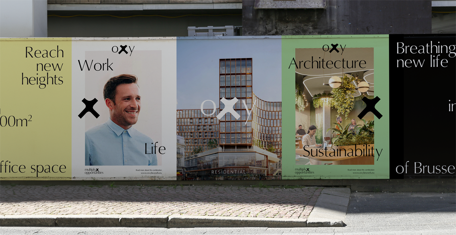
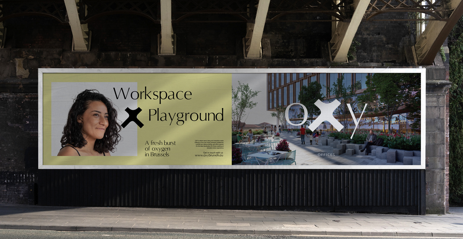
This ambitious real estate project involves the total revitalization of a prominent site in the heart of Brussels. The future complex will feature a mix of residential areas, office spaces, a hotel, retail facilities, …, creating a vibrant hub in Brussels. A refreshing addition to the city, and it’s within this ‘fresh breath’ and the multitude of new opportunities that we’ve found our inspiration for our task: to infuse this colossal structure with an identity that ignites anticipation among the citizens of Brussels.
As a first step, the gigantic building naturally needed a name to start shaping its identity. We landed on the name OXY, as this renovation will privide the neighbourhood with fresh oxygen , both literally (it will be rebuilt with eco-friendly practices, reducing CO emissions) and metaphorically (it will uplift the area). OXY will be a place for people to come together, a meeting point, and that’s exactly what we wanted to convey. With the building taking the shape of an X, we couldn’t have asked for a better symbol, as it’s simply the multiplication sign. And that’s precisely what the building does – it multiplies connections among people, fostering new collaborations. This concept was visually evident in all our communications: from the website to digital campaigns, from the smallest printed materials (stickers) to large-scale advertisements on the building itself, we made sure it was clear that OXY was on the horizon for the residents, businesses, and investors of Brussels.