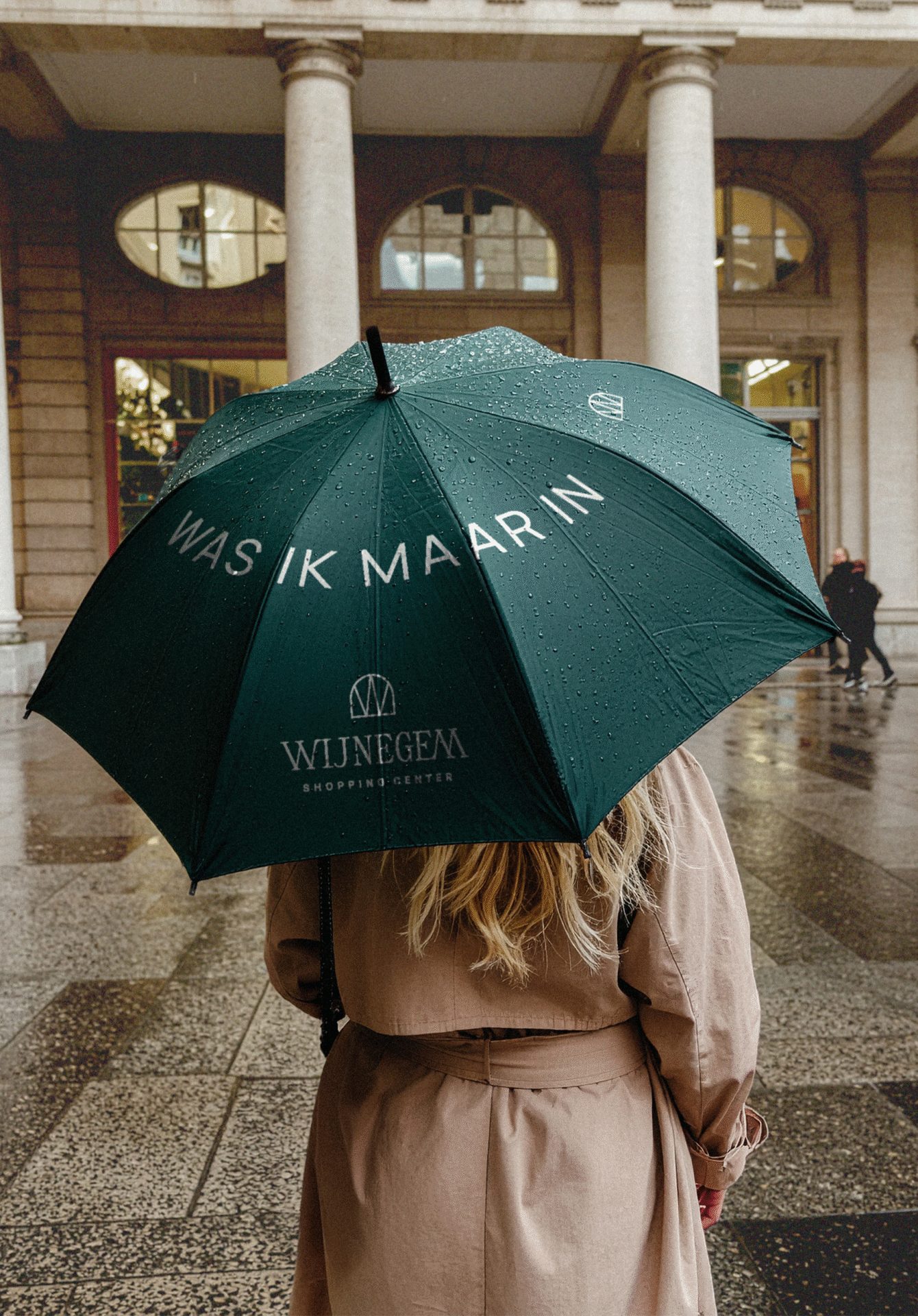

Wijnegem Shop Eat Enjoy set out on a bold transformation. Not just a renovation, but a complete reinvention of Belgium’s most iconic shopping destination. With a new interior came the need for a new identity and a new name.To shape the future, we first looked to the past. We returned to the name that everyone already knew by heart: Wijnegem Shopping Center. A name that has always stood for scale, quality, and familiarity. Our mission was to give this classic name a renewed sense of style, one that reflects the elegance of the new interior while keeping its timeless spirit alive. The result is an identity that feels both sophisticated and enduring, able to evolve as the center continues to grow.
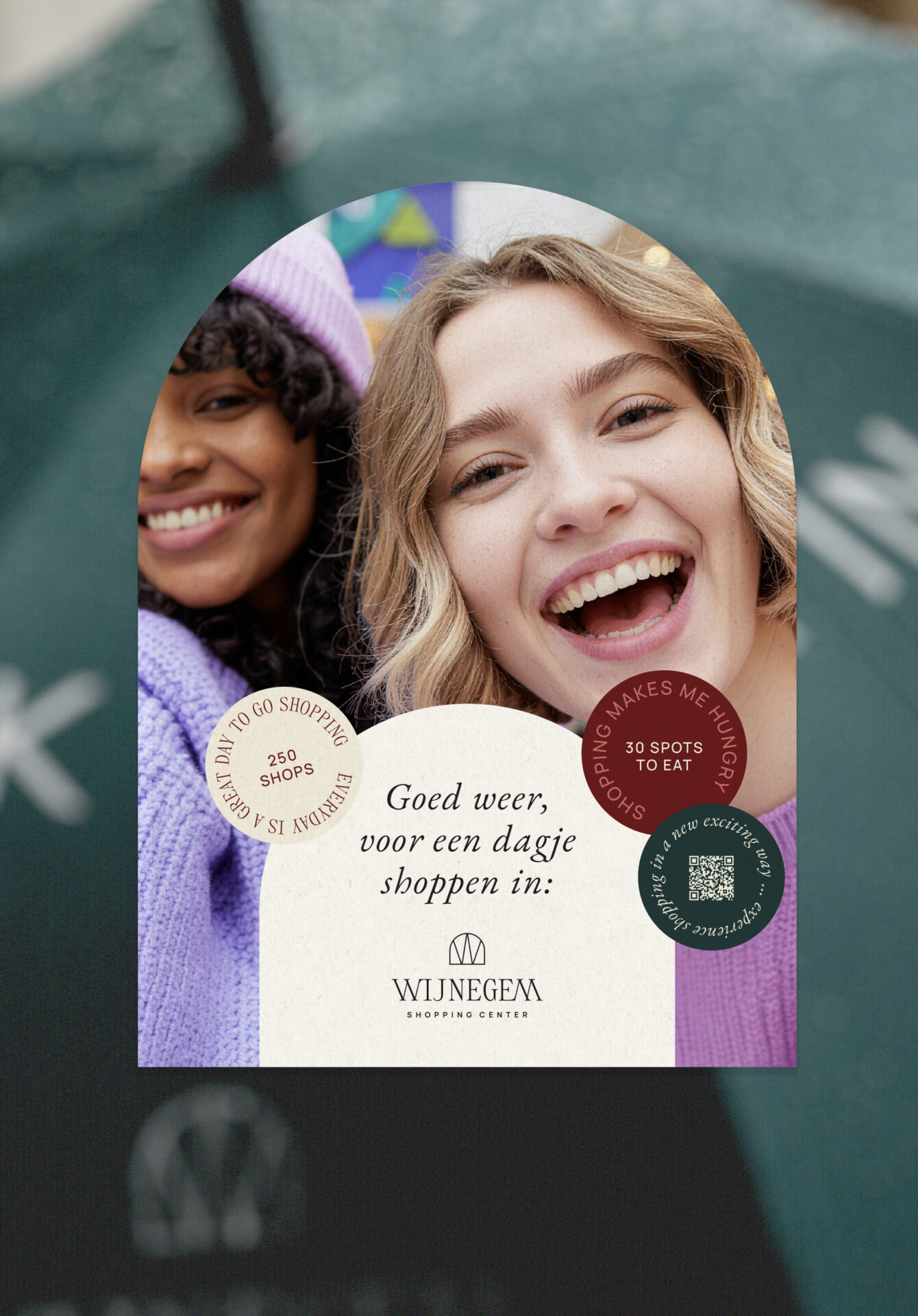
We brought Wijnegem Shopping Center back to its roots and gave it a refined new expression. The color palette draws directly from the interior design, creating a visual link between the brand and its physical spaces. To add character, we introduced playful graphic elements inspired by shopping notes and discount stickers, small touches that add warmth and approachability to the brand.The logo pays tribute to the center’s iconic arch, a familiar shape that once again crowns the heart of Belgian retail. Together, these elements create a brand that celebrates its legacy
The arch is where it all begins at Wijnegem Shopping Center. From the logo to the architecture, it shapes everything and radiates a warm welcome. When you think of Wijnegem Shopping Center, you picture that unmistakable arch entry, right? Once a subtle detail, it now takes the spotlight visually and structurally. And of course, it’s a clever nod to the very first logo, because we couldn’t skip that rich history!

